|
RadiantQ jQuery Gantt Package
Multi Column Tree Grid
|   |
|
RadiantQ jQuery Gantt Package
Multi Column Tree Grid
| |
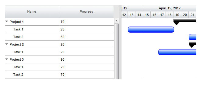
Multi Column Tree using FlexyTable
FlexyTable is the widget (derives from VWGrid) that is used to visualize a collapsible multi-column tree list in the left of the gantt.
In your code, set columns collection to columns property in GanttTableOptions.
|
//all the FlexyTable Columns are defined here var columns = [ { field: "Name", title: "Name", //RadiantQ.Default.Template.FlexyGanttExpandableTextBlockTemplate returns a pre-designed template(which a expander cue and some divs) //nameConverter - a function name, which will retuen the name based on the data. template: RadiantQ.Default.Template.FlexyGanttExpandableTextBlockTemplate("nameConverter") }]; var $gantt_container = $("#gantt_container"); // Initialize the FlexyGantt widget. $gantt_container.FlexyGantt({ DataSource: self.jsonData, GanttTableOptions: { columns: columns }, ..... }); |
|
In ASP.NET MVC |
|
@Html.JQFlexyGantt( new JQFlexyGanttSettings() { ControlId = "gantt_container", GanttTableOptions = new GanttTableOptions() { Columns = new Columns(){ new Column(){ field = "Name", title = "Name", width = 110, //flexyGantNameEditor is a template script id. clientEditorTemplate="flexyGantNameEditor" } } }, .... } ) |
|
In ASP.NET |
|
<RQ:FlexyGantt runat="server" ID="gantt" Height="500" ...> <GanttTableOptions> <Columns> <GanttBase:Column field="Name" title="Name" clientTemplate="flexyGanttNameColumnTemplate" clientEditorTemplate="flexyGanttExpandableTextBoxEditor"></GanttBase:Column> </Columns> </GanttTableOptions> </RQ:FlexyGantt> |
Each columns in the FlexyTable should be defined via Column definition
When you define the template, note that the DataContext for each row is a "node" in the underlying hierarchy and since this is a hierarchy, the type of bound object in each row could be different. Use Converters in the template to display appropriate data in the cells like the nameConverter below.
|
var columns = [ { field: "Name", title: "Name", //RadiantQ.Default.Template.FlexyGanttExpandableTextBlockTemplate returns a pre-designed expandable text box template. //nameConverter - a function name, which will retuen the name based on the data. template: RadiantQ.Default.Template.FlexyGanttExpandableTextBlockTemplate("nameConverter") }]; //nameConverter is global method. var nameConverter = function (flexyNodeData, value) { var data; // The grid calls this converter with flexyNodeData as a arg. if (flexyNodeData) data = flexyNodeData.Data(); // The grid calls this converter with flexyNodeData as a datacontext. else data = this.data; if (data["PName"]) return data["PName"]; else if (data["TaskName"]) return data["TaskName"]; return; } |
Here is the another example column definition for FlexyTable.
|
var columns = [{ ................. template: "<div>${progressConverter(data)}</div>", }]; |
Make sure you defined the progress column in FlexyTable.
|
function progressConverter(data) {
if (data.Data()["PName"] ) { var tasks = data.Data().Tasks; var totalprogress = 0; for(var i = 0; i < tasks.length; i ++ ){ totalprogress += tasks[i].Progress } return totalprogress; } else if (data.Data()["TaskName"] ) return data.Data()["Progress"];
return 0; } |
Here is the resultant FlexyTable rendered in the gantt:
This is illustrated in this samples:
In HTML : ..\Samples\FlexyGanttCustomTaskLook.htm.
In ASP.NET MVC : ..\Views\Home\FlexyGantt\FlexyGanttCustomTaskLook.cshtml.
In ASP.NET : ..\Samples\FlexyGantt\FlexyGanttCustomTaskLook.aspx.
Alternative Row background
Alternative rows in the GanttTable has the .rq-grid-alternative-background class. In this class you can specify the background of the alternative row background color.
CSS style
|
.rq-grid-alternative-background {
background-color:#F7F9FB; } |
© RadiantQ 2022. All Rights Reserved.