|
RadiantQ WPF Gantt
Task Bar Adornments
|   |
|
RadiantQ WPF Gantt
Task Bar Adornments
| |
It's common to customize the look and feel of a task bar with custom adornments to visualize more information available in the bound objects.
For example, there could be a "PlannedEndTime" property in your bound list elements that you want to visualize in the gantt chart just so you know which tasks went past-due.
You might want to visualize such tasks that went past-due with a "red bar" indicating the planned end time for such tasks.
To achieve this first define a TaskBarAdornerTemplate.
TaskBarAdornerTemplate
This property in the GanttControl lets you define the UI for your custom adorner. For example (for complete source take a look at the "GanttControlTemplateSample1":
<gantt:GanttControl x:Name="ganttControl" >
<!--Custom template to indicate tasks that went past due-->
<gantt:GanttControl.TaskBarAdornerTemplate>
<ControlTemplate>
<!--Note that a GanttTaskItemBar instance will be the DataContext for all these UI elements, so you can refer
to it's properties in the Binding code below.
1) To refer to a property in the IActivity instance, the binding expression will look like this: "{Binding ActivityView.Activity.StartTime}"
2) The refer to a property in the underlying data source, the binding expression will look like this: "{Binding ActivityView.Activity.DataSource.PlannedEndTime}"-->
<Border Height="{Binding Height}" Width="50" Visibility="{Binding Converter={StaticResource visibilityConverter}}"
CornerRadius="2" Margin="{Binding Converter={StaticResource leftConverter}}"
BorderBrush="Red" BorderThickness="1" IsHitTestVisible="False">
<Border.Background>
<LinearGradientBrush StartPoint="0,0" EndPoint="0,1">
<LinearGradientBrush.GradientStops>
<GradientStop Color="Transparent" Offset="0" />
<GradientStop Color="#88FFA07A" Offset="0.25" />
<GradientStop Color="#88FF6347" Offset="1" />
</LinearGradientBrush.GradientStops>
</LinearGradientBrush>
</Border.Background>
</Border>
</ControlTemplate>
</gantt:GanttControl.TaskBarAdornerTemplate>
</gantt:GanttControl>
And the LeftConverter and VisibilityConverters would look like this:
public class VisibilityConverter : IValueConverter
{
public object Convert(object value, Type targetType, object parameter, System.Globalization.CultureInfo culture)
{
GanttTaskItemBar bar = value as GanttTaskItemBar;
if (bar.IsParent)
return Visibility.Collapsed;
else
{
DateTime plannedEnd = ((CustomTask)((DataBoundActivity)bar.ActivityView.Activity).DataSource).PlannedEndTime;
DateTime actualEnd = bar.ActivityView.Activity.EndTime;
// If the actual end is before the planned end, then it was not past due, so hide this.
if (actualEnd < plannedEnd)
return Visibility.Collapsed;
else
return Visibility.Visible;
}
}
}
public class LeftConverter : IValueConverter
{
public object Convert(object value, Type targetType, object parameter, System.Globalization.CultureInfo culture)
{
GanttTaskItemBar bar = value as GanttTaskItemBar;
if (bar.IsParent)
return new Thickness(0);
else
{
DateTime plannedEnd = ((CustomTask)((DataBoundActivity)bar.ActivityView.Activity).DataSource).PlannedEndTime;
DateTime actualEnd = bar.ActivityView.Activity.EndTime;
if (actualEnd < plannedEnd)
return new Thickness(0);
// Use this utility in GanttTaskItemBar to determine the location of the past due bar.
double rightX = bar.ConvertTimeToX(plannedEnd);
// 50 is the width specified in XAML.
// Return the setting for the margin.
return new Thickness(rightX - 50, -2, 0, 0);
}
}
}
The above settings will result in red-bar adornments indicating past-due tasks as shown below:
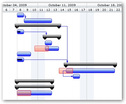
Red bar adornments to indicate past due tasks
� RadiantQ 2009 - 2019. All Rights Reserved.